Best Ecommerce Website Design: 28 Eye-Catching Examples That Will Blow Your Mind (2022)

In this best eCommerce website design guide, we’ve listed some mind-blowing examples and some outstanding themes that you can use for your site to impress your customers.
We understand why you’re looking for good eCommerce website design examples because you and we both know that the first impression is the last impression.
A great web design idea should be considered when creating an eCommerce site.
Whenever customers come to your site, what do they see in the first place?
Obviously, your site’s design, intuitiveness, responsiveness, etc, after that their second attention goes to your products.
However, if your site does not give a pleasant user experience, they will go to your competitors.
So, the visuals and content of an eCommerce website need to both inform and inspire.
What’s more?
Your design should use UX principles to create a smooth buying experience so that there is no resistance to completing the final checkout.
Furthermore, your site should reflect the value of your business through a clear, intentional style.
Aside from that, a minimalist design also works well; your site does not need to be overburdened with animations.
Just make sure your site is visually appealing, loads quickly, and does not interfere with your customers’ browsing experience.
Let us do the heavy lifting for you.
You can find some of the best eCommerce website design templates here. All of them are highly attractive and provide good value.
So let’s just go ahead and look into it.
28 Best Ecommerce Website Design Examples
1. Chubbies
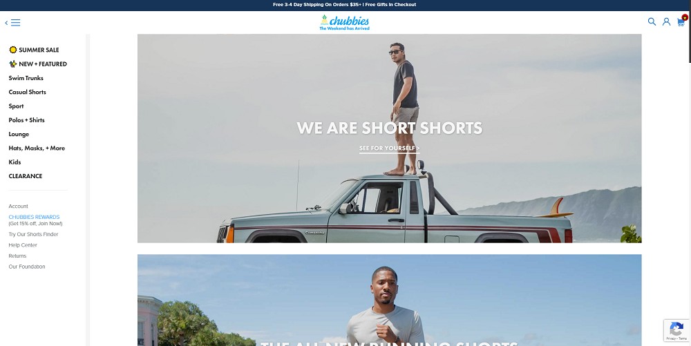
The first website on our list of best eCommerce website design examples is chubbies.
It is a swimwear company that sells casual shorts, swim trunks, polos + shirts, loungewear, and more.
Chubbies is vibrantly colored, with images of people having fun on vacation in the mountains, on the beach, and so on.
This gives people a vacation vibe, which leads them to buy.
When people land on their homepage, all will they see is colorful swim shorts, running shorts, polos, more.
Hence, it is a perfect example of how copy and visuals can communicate the values of a brand.
2. Mahabis
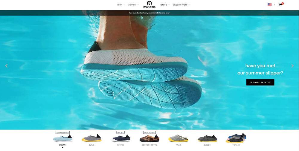
The second website on our list is Mahabis which sells summer slippers.
On its homepage, you’ll see an image slideshow of how summer slippers make your summer comfortable.
It offers a visual product category underneath the slideshow that covers its collection of canvas, mule, classic, special editions, and more.
Plus, there’s a lot of use of white spaces that make it clean & attractive.
Mahabis concentrates on displaying its high-quality products straight away.
This website’s incredible design highlights even the smallest elements in order to entice a potential consumer.
3. Skechers
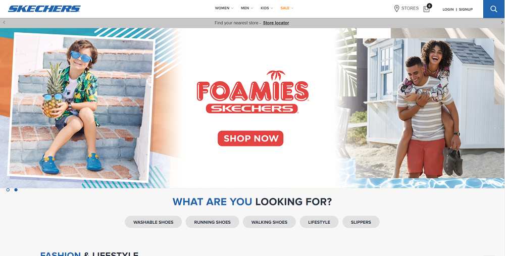
One of the popular names that everyone knows, but not everyone has visited its site.
And if you have visited, then you know how cool & engaging it is.
The site is extremely user-friendly; as soon as you arrive at its homepage, you’ll notice the categories that indicate the type of shoes you’re looking for.
The cool thing about this is that there is a sales menu, so if someone wants to buy in sales, they can go straight to the menu and look at all the discounted items.
4. Helbak

Helbak is another excellent example of a small business website design that doesn’t have to be overdone.
It has a simple homepage listed with its main 4 products, which are limited to just one scroll.
Moreover, you can even explore all its products from its menu.
Their products are elegant and well-kept.
The design uses the color of the products and white space in the background to highlight the aesthetic side of the things.
As a result, the site is simple, extremely intuitive, neat, and appealing to the eye.
5. Skullcandy
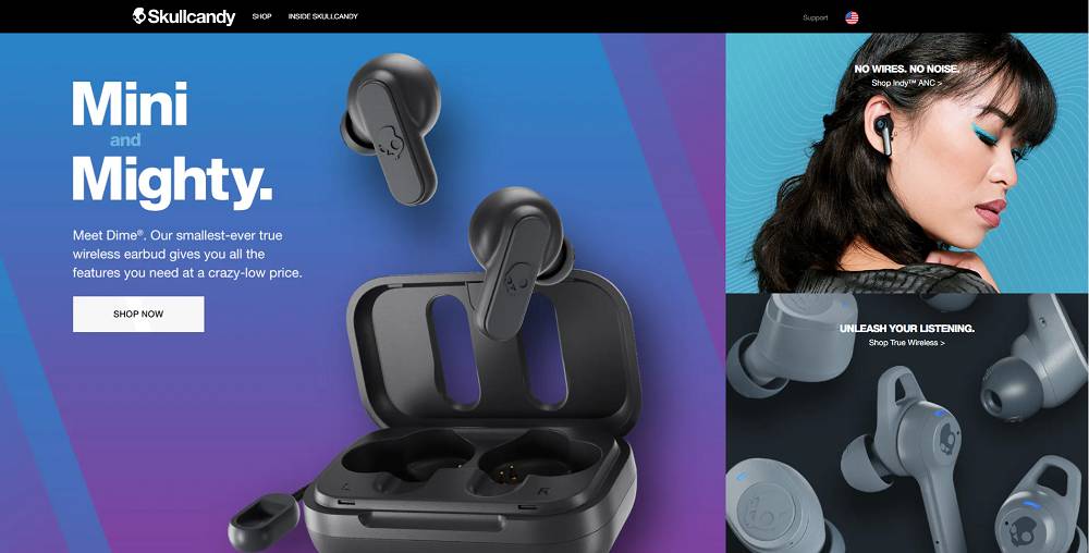
You all love Skullcandy.
You’d also love its site if you haven’t visited.
Skullcandy is all about the color combination. Furthermore, it has been designed to convey to visitors that this brand is all about quality.
You won’t have to look for anything because the homepage lists all of the essentials as well as newly released products.
So that customers can check it out and buy it right away.
Overall, the website is simple to use and provides a seamless experience for visitors by keeping them engaged.
6. MVMT
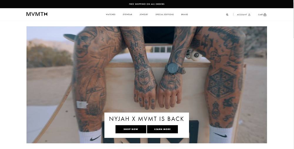
MVMT is another popular American brand that sells watches, sunglasses, and other accessories.
On its homepage, there’s an explainer video that show how people can wear watches on different occasions.
So when the customer sees the video, they imagine themselves in it, which triggers them to purchase.
Plus, there’s a trending section listed with all the trendy watches.
All the sections are well placed, like watches, jewelry, etc so that customers can know what they are looking at.
7. Skagen
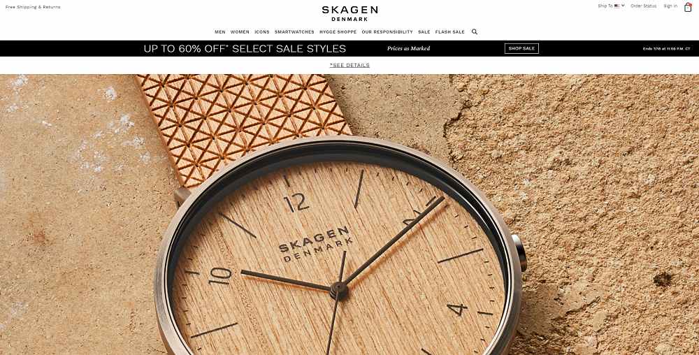
You have never seen such a site like this before.
Skagen sells classic casual watches, smartwatches, jewelry, etc. But their main focus is on the watches.
The brand uses close-up, high-resolution images to demonstrate the value of the brand’s products.
Moreover, the company uses highly detailed images which showcase quality material, dial metal, and screen clarity.
Not only that but its homepage also shows how they’re becoming more environmentally sustainable.
This catches the customer’s attention and amuses them.
8. Leaf & Clay
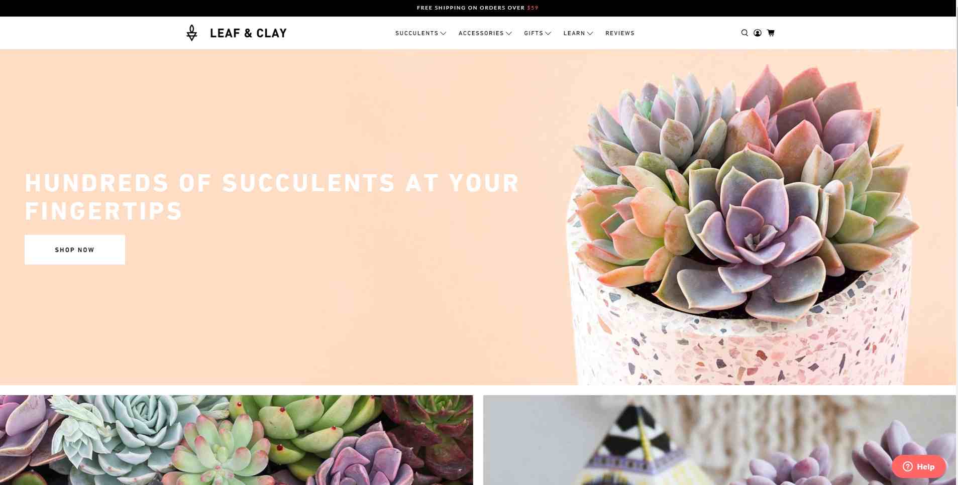
As the name depicts, Leaf & Clay is a company that sells succulent plants, seeds, and garden goods.
With a unique homepage design, the plant company Leaf & Clay makes their website easy to navigate.
Rather than displaying a single photo, the store displays many photos to highlight the various store categories.
Because the plants are so diverse, this arrangement is beneficial for visitors.
Visitors are one step closer to deciding whether or not they want the product after seeing photographs.
This is a good design concept to keep in mind.
9. Glossier
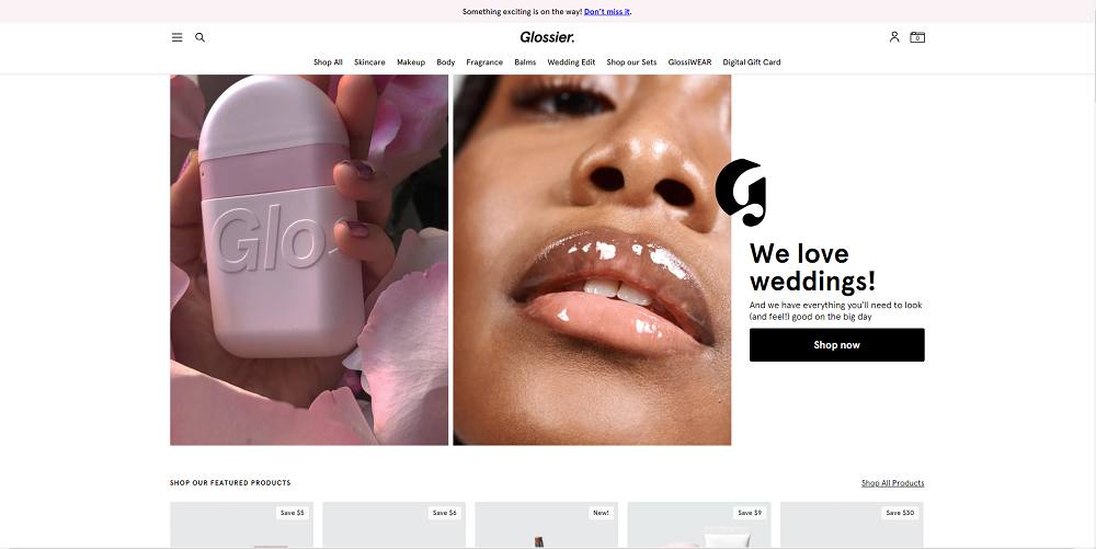
Glossier sells women’s skincare, makeup, body care, and fragrance products.
It is a wonderful site that even men would stop for a while to go through.
Why?
Because the design is so appealing and attractive.
Glossier urges users to explore their websites and browse their categories to find the products they want.
With an image-oriented menu, Glossier encourages visitors to explore categories.
Each category displays product previews. This isn’t found very often.
10. Dollar Shave Club
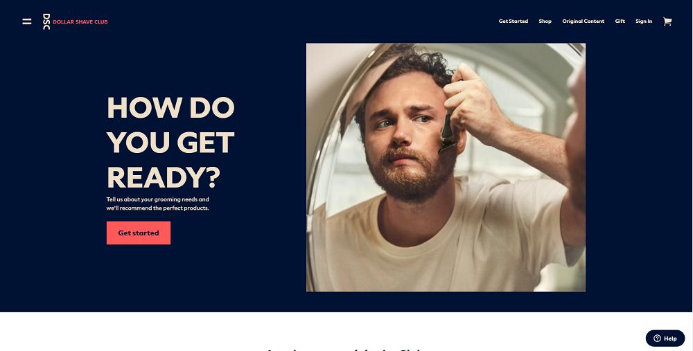
Again the color combination wins here.
You can see the website, and when you click on get started, it will take you to a quiz that will ask you about your preferences.
This allows customers to find exactly what they are looking for.
Photos of people’s faces in web design give your site a more personal feel, which helps visitors trust you.
With a changing collection of photos showing people utilizing their products, Dollar Shave Club takes advantage of this idea.
11. NatureBox
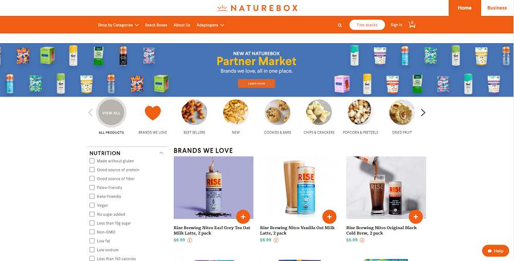
NatureBox is a company that sells snacks made using pure and high-quality ingredients.
NatureBox encourages visitors to browse their website by providing various products and categories on the homepage.
Now why do these customers like this website because of web design?
Web design is just one factor, but customers find it far more convenient to select a category and shop straight from the homepage.
Giving visitors both browsing and shopping choices increases the chances that they will begin shopping.
12. Crema
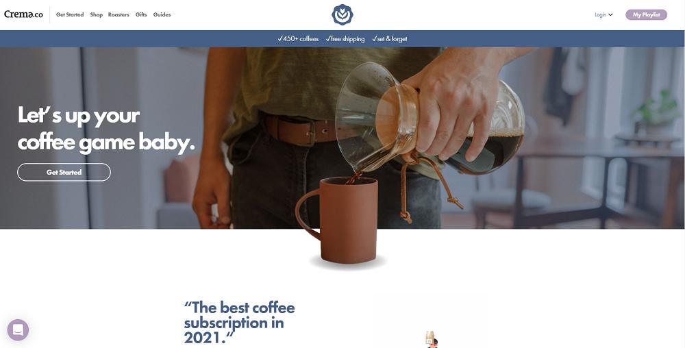
Even non-coffee drinkers will be impressed by this site. Its design, elements, and animations will keep you on the site for a long time.
Crema’s customer survey, which is easily accessible and visually focused, allows visitors to interact with their products.
Visitors are taken to an 8 question survey with graphics for each answer after clicking on the “Get Started” on the homepage.
This survey is fantastic for encouraging visitor involvement because it is easy to reach and respond to.
13. Premium Teas
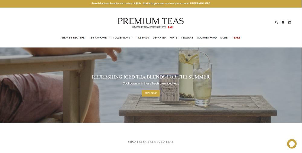
It’s time for tea.
The design of this eCommerce store is simple, modern, and elegant.
The teas are displayed in a way that allows users to scroll through and select their preferred tea quickly.
With the help of a lot of white space, the Premium Teas e-commerce business is able to accomplish this.
Moreover, the page concentrates more on visual representation instead of being overrun with words.
When you click on any of the products, you’ll be taken to a page with a thorough explanation of the tea.
This covers product details such as the product’s aroma, caffeine content, brewing time, brewing temperature, and much more helpful information.
14. THING IND.
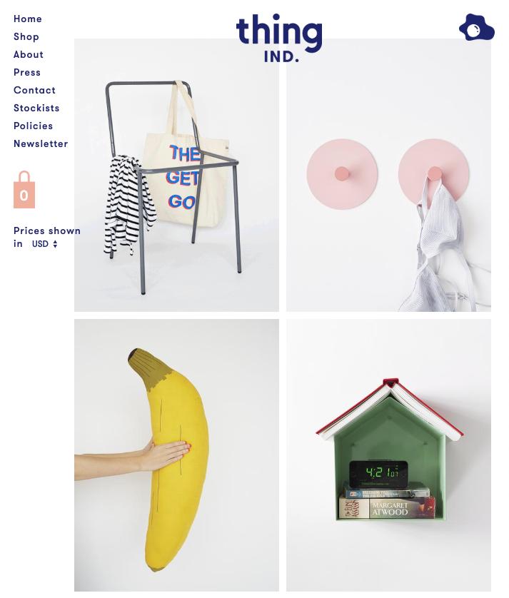
This site is a little bit different from others.
It’s a simple website that offers a lot of fun.
The site attracts visitors with its huge typography, which is navy instead of black.
It’s not always easy to work humor into your copy, but they went above and beyond, which ultimately paid off.
Not that their products need a lot of detail as the product photography guarantees that the things stand out.
Overall, the website provides a fun approach to assist in the sale of their amusing products.
15. Wannabe Toys
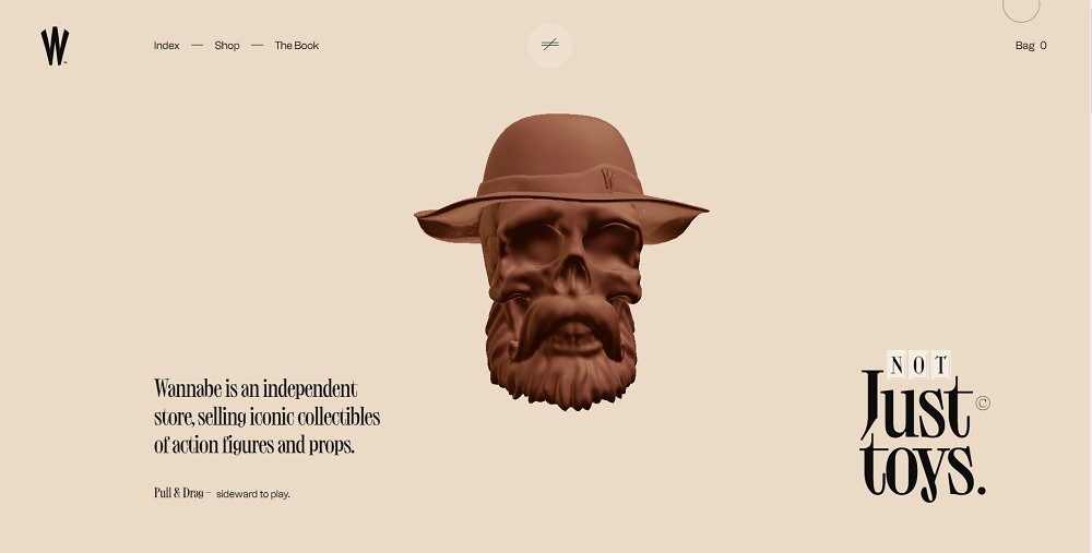
This site is marvelous.
Wannabe toys sell props and collectibles, action figures, and superhero toys such as Ironman, Spiderman, Batman, and others.
All of the toys are well-made and neatly organized in a grid.
Each product is effectively lifted out of its digital square, bringing it one step closer to really being in the hands of a fan.
Wannabe toys are the live example that tells product pages don’t have to be constrained by straight lines and that the grid can be subverted in subtle ways.
16. Friendsday
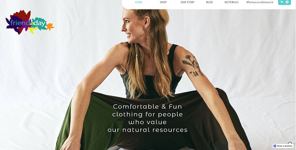
Friendsday is all about the vibrant patterns that are made out of organic cotton materials.
All of their clothing designs have a fruitiness to them, but with a high fashion sense, making this outerwear for only the most refined of nature enthusiasts.
Flowers appear throughout Friendsday’s branding, which is inspired by nature. Models hold them, they sit in the background, and they’re woven into the clothes’ patterns.
This link to the outside world symbolizes so much of who they are.
17. Solo Stove

If you love campfires and gathering around the fire then this Ecommerce Website Design you must consider.
The site’s design has been created with the customers’ points of view in mind.
It has a banner that shows a group of people enjoying around a big fire pit.
Underneath the banner, there’s a category of all of the outdoor fire products that the site sells.
This makes it simple for customers to find what they’re looking for.
Moreover, they have shown the images of happy customers with their fire products, which increases trust among website visitors.
18. Tessemae’s
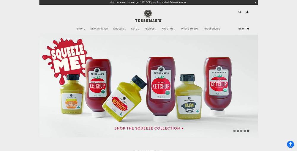
Tesseme is known for its delicious sauces and ketchup.
The site’s user interface is quite pleasant, you’ll see menus of different products like keto products, recipes, whole30, and more.
The site design has been structured with customers in mind.
A lot of usage of delicious foods loaded with various sauces and ketchup.
This attracts customers to make a purchase on-site.
What is more important is having a wide range of flavors and varieties.
Hence, design and product quality play an essential role to sell any item online.
19. Bugaboo
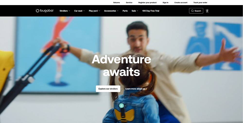
Another best eCommerce website design is Bugaboo.
A design that tells straight what they are offering with lucrative texts.
Talking about its homepage, a video shows how their products make life easy for parents.
Moreover, to catch the attention, they have offered a heavy discount on their special products.
This is how you can build trust in customers by showing them its quality and professional design.
20. Simply Chocolate
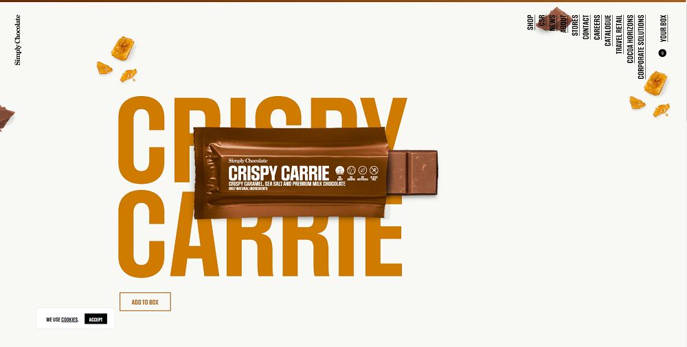
You will fall in love with their Website design and never leave without buying their chocolates.
The design is so unique that you have never seen it in your life.
The animations, colors, and photographs will make your mouth water.
Just scroll down, and you’ll see a new chocolate every time with a new color and animation that unwraps the chocolate and pops it up.
It is a great way to highlight your individual products and keep your customers engaged.
21. Charlotte Stone
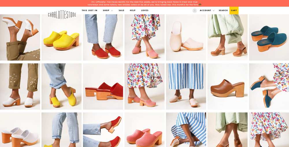
As soon as you open land on its homepage, you’ll see nothing but the variety of women’s footwear products.
The design is very subtle, the primary colors you will see here are light pink, yellow, and white, accompanied by soft patterns.
This ecommerce website design complements the product that they are attempting to sell.
Plus, It has a very feminine and fresh feel to it, with the font matching the rest of the website’s design.
22. Archie Rose
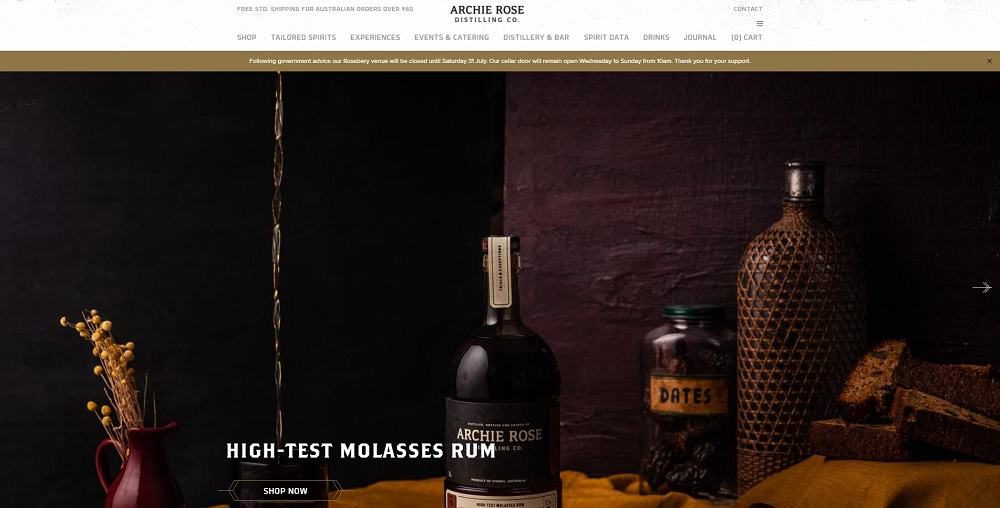
A very professional and stunning eCommerce website design.
Archie Rose is a distillery that produces & sells whiskies, gins, vodkas, rums, and other spirits.
The best thing they’ve done is to include a little bit of information about how they began their journey as “our story” on the homepage.
What this does is that it enables people to read about its quality and credibility.
They have also demonstrated how they produce their liquors with numerous videos and photographs.
Overall, the second most important thing to remember is to properly set the elements to see maximum users.
23. Thursday Boot
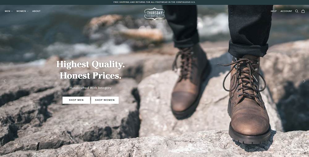
Another great website design to consider if you’re looking for opening an online boot store.
On the homepage, a slider depicts people in various terrains wearing different types of boots.
You’ll also notice different categories, which help customers find what they want to purchase.
The design is very subtle, using a plain white background and many pictures of boots, sneakers, jackets, etc.
Sometimes if your design is minimal, but your products have some worth, you will never run out of sales and traffic.
24. 100% Pure
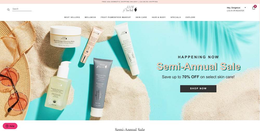
Pink is their primary color on the whole website.
This eCommerce site’s design isn’t that fancy but looks very clean, feminine, and attractive.
We wanted to include a less dramatic eCommerce website design example to demonstrate that you don’t have to be particularly creative to have a good-looking website.
It is acceptable to begin simply as long as your website is simple to navigate – just like 100% pure.
25. Home Science Tools
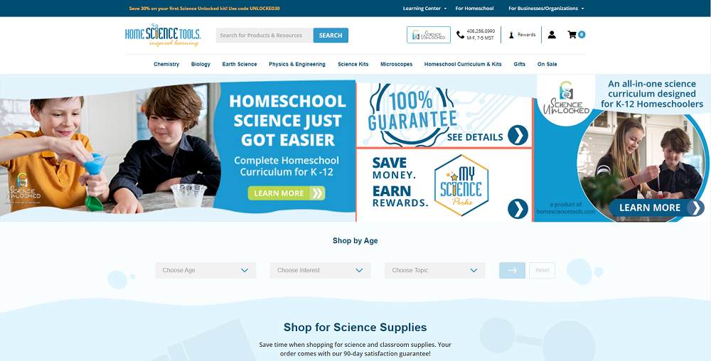
It can be difficult to direct your customers to the things that they require if your e-commerce business sells a large number of distinct products.
Well, this isn’t the case with the Home Science Tools because it displays product categories and utilizes custom elements like “Shop by Age”.
Because of the well-organized categories, visitors can quickly find new science projects.
It is the perfect example of a well-organized design that kids even like.
26. Blueapron
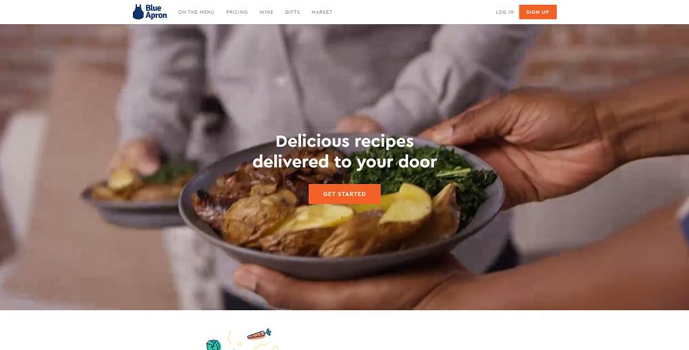
This is the kind of website design you’d desire for your own.
On the home page slider, a video of a family cooking and enjoying meals from Blueapron gives off a very welcoming vibe.
The main color of this design is a blue and white background which looks very pleasant.
They have also demonstrated the process of preparing your meals and delivering them to you, so you are aware of the quality and their system.
Furthermore, the menus and layouts are so intuitive that anyone can sign up and order their weekly meals.
27. Dick Moby
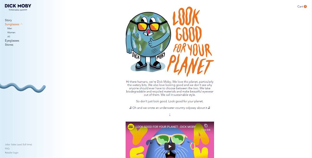
Dick moby’s design is not like the other ones on this list.
They have used all the fun elements on their site and used a theme of the ocean.
As you scroll down the page, you will learn more about the products and everything, along with it the color gradually darkens as it is an ocean theme.
However, the concept of Dick Moby is unique. It is aimed at environmentally concerned consumers, and they make it evident from the moment you land on their homepage.
28. Sgrappa

The last & best eCommerce website design on our list is Sgrappa.
Well, we have no words for this side.
This is the kind of design that you may rarely find on the internet.
Whether or not customers purchase from it, they will definitely go through the entire site for sure.
Sgrappa sells cocktails; they have listed several cocktails on their site, but the journey to reach that product page is quite enjoyable.
The black and white theme with unique animations feels great, even you can play with some elements using your mouse.
It will increase dwell time and user engagement.
Last Words On Best Ecommerce Website Design
These are the best eCommerce website examples that you should keep in mind when creating your own.
However, if you want to check out Some stunning eCommerce website design templates that will help increase your sales, you can check them right now.
One more thing, web design is not everything, your products should also be helpful to your customers.
Plus, you should also focus on digital marketing activities (such as SEO, social media optimization, etc) to bring more customers to your site.
The finest online retailers find the perfect balance between all of these factors, resulting in a strong brand and increased conversion rates.
Again, don’t forget to check out the beautiful templates at the best eCommerce website design company.
So, which eCommerce sites do you think we should include on this list?
Let us know some of the other creative website designs.


Hello to everyone, for the reason that I am actually keen on reading this website’s post to be updated daily.
It contains fastidious data.
Everyone loves what you guys tend to be up too. Such clever work and exposure! Keep up the good works guys I’ve added you guys to my blogroll.
Thanks Alice,
We are always working to provide useful articles that will benefit others.
Thank you for some other informative website. The place else may just I get that kind of information written in such a perfect method.
Hey Mona,
Thanks for your kind words.
Which website design you liked?
It’s my pleasure Mona!
We always write and share content that people really need and try to solve their queries.
Great! in-deep information.
Thank you for the comment. If you like, please share on social media.